Mansion in Liepaja
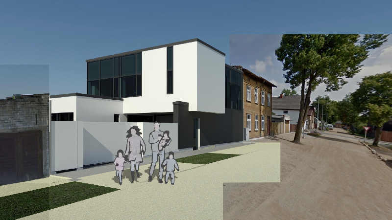
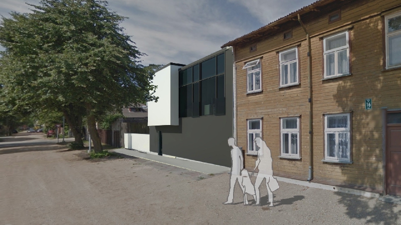
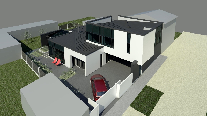
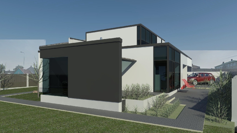
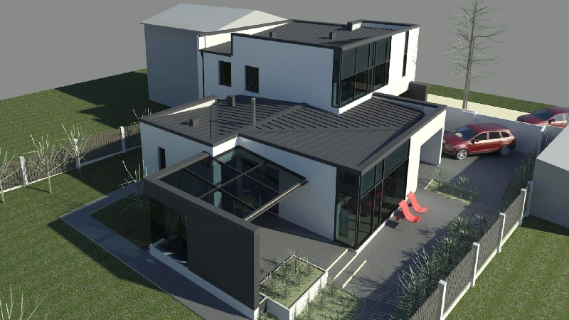
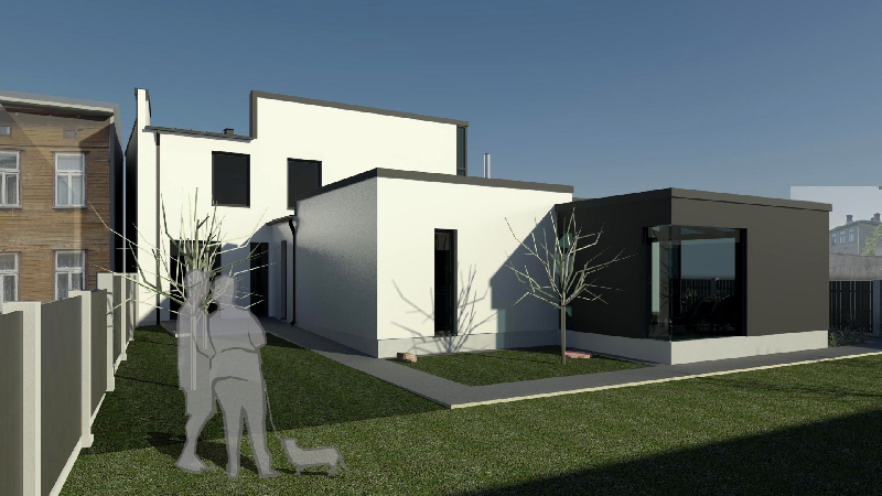
The architecture of the designed building is ascetic and minimal in its means of expression. This is the author's conviction and the client's wish. Nothing superfluous. What could be better than that? Therefore, simple cubic shapes are used, arranged in an appropriate composition and divided by the synergy of two colors, black and white. White and black also have their own nuances - material, surface structure, light reflection and color intensity. Particularly in this design, composite panels have been chosen for the facade decoration. Black also has aluminum frames and black tinted has glazing. On the courtyard side, the building is extended by a summer shed, with a large area of glazing in the roof and the facade.
Clinker pavement with green plantation islands and a lawn in the depth of the plot have been designed for the improvement of the territory.
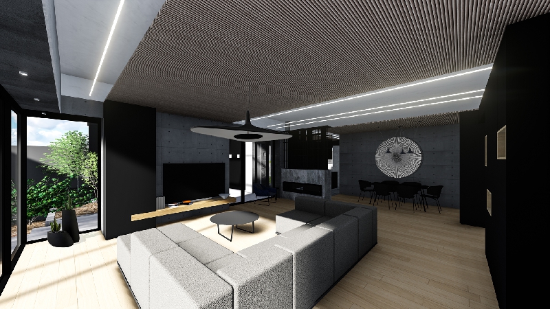
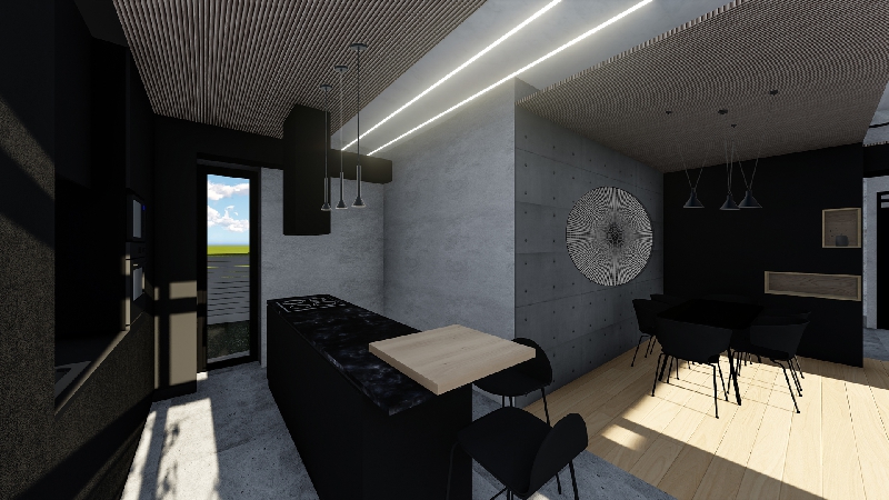
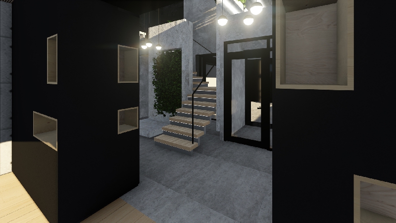
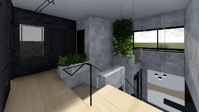
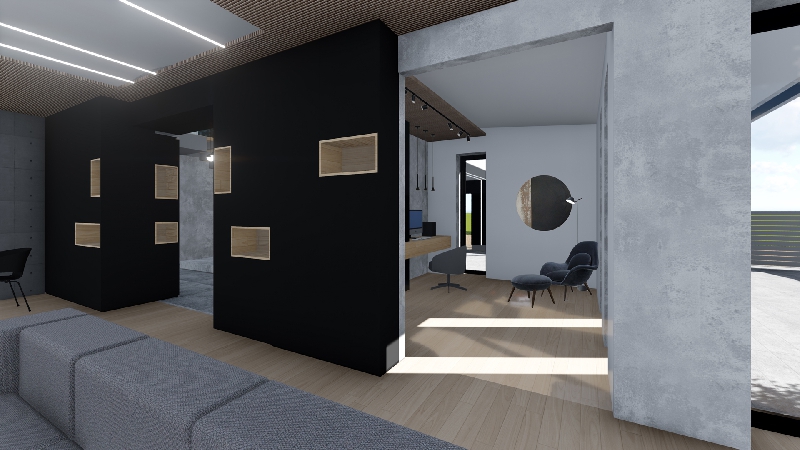
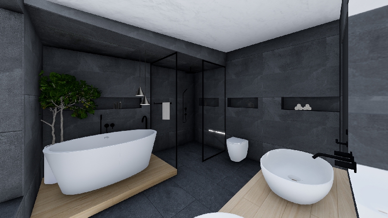
The synergy of black and white has also been used in the interior design of the building, making it a little softer with a gray tint and the presence of natural, light wood.
How to save with good architecture? |
Request information |