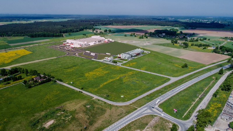
Biscuit and waffle Production Plant in Ādaži disctrict
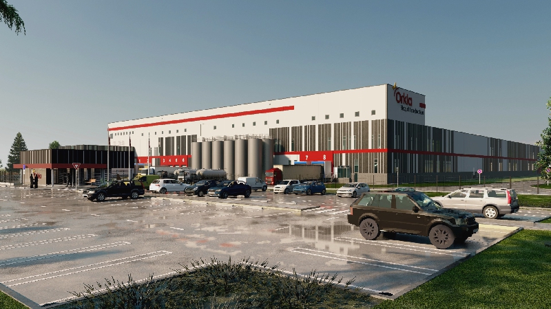
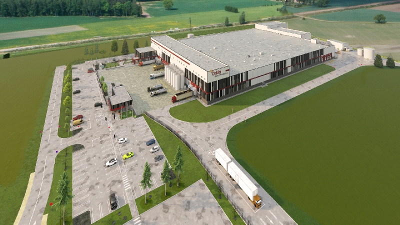
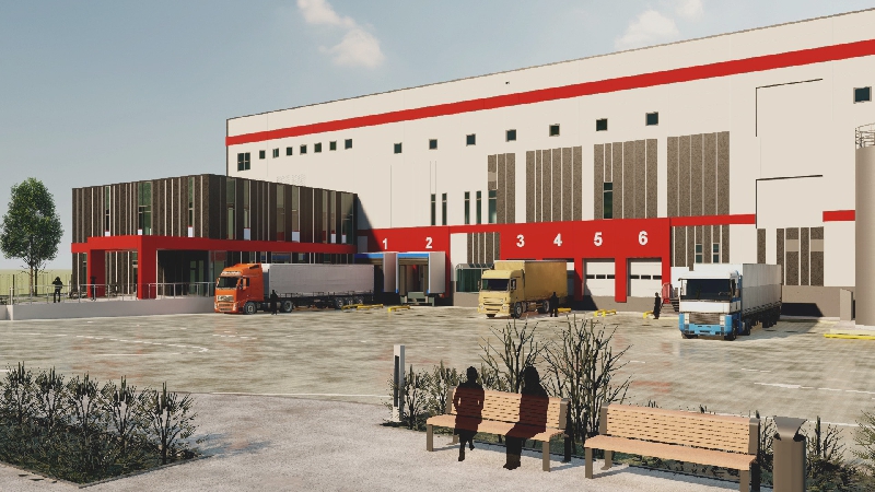
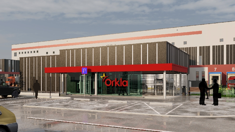
The concept of the architectural solution has been developed for participation in the design competition, where it obtained the client's responsiveness and has been gained in the building design without significant changes. Inspiration is found in the usual biscuit package, where the package itself is already as an industrial building - it has a rectangular shape and, using more as single package, a nice composition can be created. When the package is opened and some biscuits are eaten, the remaining ones make up a luminous game that is good for the facade design. In general, by direct moving the sketch in the design of the facade, the facade solution of the building has been developed with a vertically located light and dark sandwich panel rhythm, where the dark “eaten biscuit gap” in the real facade creates a window rhythm in the darkest panel locations. The proposed volume of the building is largely determined by the size and location of the technological equipment and technological flows.
The concept of interior design was chosen taking into account the company's corporate design guidelines and business values - sustainable thinking, creativity, purity of forms, color. The colors of the company's identity are used in the interior decoration - light tones, red and black


How to save with good architecture? |
Request information |